Creating a Moodboard - The First Chapter of your Brand's Visual Story
Moodboards (or style boards) are a key component for any type of design. I love creating them with and for my clients and use them as a reference guide during the design process. After the logo and/or site is complete, then I hand them off to the client so they will have it to continually refer back to when creating content for their site or social media. This is the beginning chapter of impactful brand visual storytelling.
What is a brand?
Seth Godin defines a brand as: "the set of expectations, memories, stories and relationships that, taken together, account for a consumer’s decision to choose one product or service over another." A killer logo is definitely an integral part of any brand, but it is just one factor. Creating a moodboard is another, but if you approach it from a place of story, then it can be a huge tool for you in the creation of, and the continuation of your own great brand! This can be a great place to house key elements of your brand, especially if you're a visual thinker.
Creating and Using Moodboards
I thought the best way for me to explain how to create and use a moodboard would be to share my process for this site and blog. Since its fresh on my brain, and something I'm truly passionate about, it seems like the perfect demonstration.
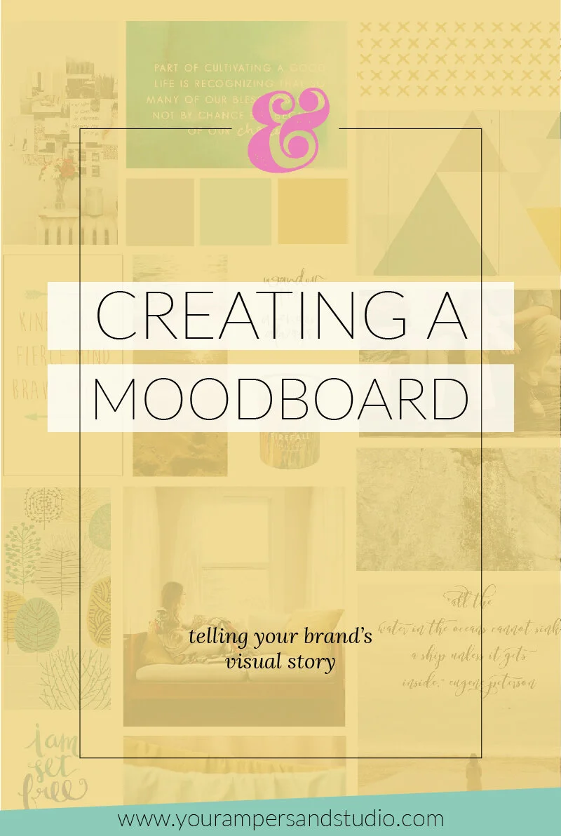
Here is the moodboard that I created for Your Ampersand Studio. This was created using a moodboard template from the super talented Hannah of Pommel Lane.
I knew that I wanted Your Ampersand Studio to be a place where photographers could come to feel inspired, encouraged, motivated and not alone on the journey. I wanted the colors, fonts, and photography to come together and express all of that at first glance. It is my goal that Your Ampersand Studio feels like a best friend's house...warm, inviting, comfortable and full of joy.
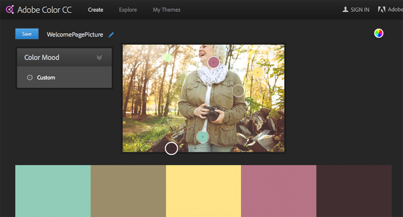
I was completely inspired by the photo that Bre of Bre Rachelle Photography took of me during our joint shoot last fall. It became the starting off point for the whole color scheme. I pulled the image into Adobe Color CC and picked my favorite colors out of it. I didn't realize that day when I got dressed for my photoshoot that I would be setting the future colors for my website...all the way down to my earrings. But these colors feel so "me" and they help me communicate my brand story.
And then came one of my favorite parts: scouring my Pinterest boards for more inspiration. I searched for color combinations, themes, and elements I knew would match my aesthetic and started saving my favorites. I brought them all together in Photoshop and plugged them into the moodboard template, along with the colors I'd settled on. I moved things around, focused on how the images made me feel and eventually settled on the layout I shared above. I made sure to add a spot for the font I was using for my logo and site elements and it all came together.
And now I have something to refer to and look at whenever I make a decision for what to create, share or produce for my brand. That streamlines things, helps me to stay consistent, and keeps things pretty.
Do you have a moodboard for your brand?
Every photographer that I get to work and connect with will come away with one of these moodboards curated just for them. It will be my gift to the growth of their brand, beyond their logo design. I have mine hanging in my office to keep me inspired. Where will you hang yours?


